WhatsApp keeps refining the bottom navigation bar on Android
WhatsApp is exploring a cleaner design for the bottom navigation bar without text labels. This makes the bar look more minimal than the previous version. This is still not the final design since WhatsApp continues to explore different layouts before the official release.
| Key Points | Details |
|---|---|
| Feature: | Redesigned bottom navigation bar |
| Status: | Under development |
| Availability info: | This feature is currently in development and not yet available for beta testing. |
| Previous news: | WhatsApp Plus is testing Focus schedules for chat lists! |
WhatsApp announced a redesigned bottom navigation bar last week
In the post about the WhatsApp beta for Android 2.26.38.10 update, we announced a refreshed bottom navigation bar. The new design separates the bar from the main interface and gives it rounded corners. This redesign makes the look closer to the tab bar on the iOS app. We noted that WhatsApp would continue to refine the bottom navigation bar before releasing it to the public.
WhatsApp is now testing a new variation without labels
Just a few days after our first report, WhatsApp is already testing a different configuration of the same bar. The overall design is still the same. We can see the same floating bottom navigation bar with rounded corners. But WhatsApp is also exploring what the bar looks like without text labels under the icons. We discovered this with the WhatsApp beta for Android 2.26.39.10 update, which is available on the Google Play Store. Specifically, WhatsApp is testing a label-free version of the new bottom navigation bar.
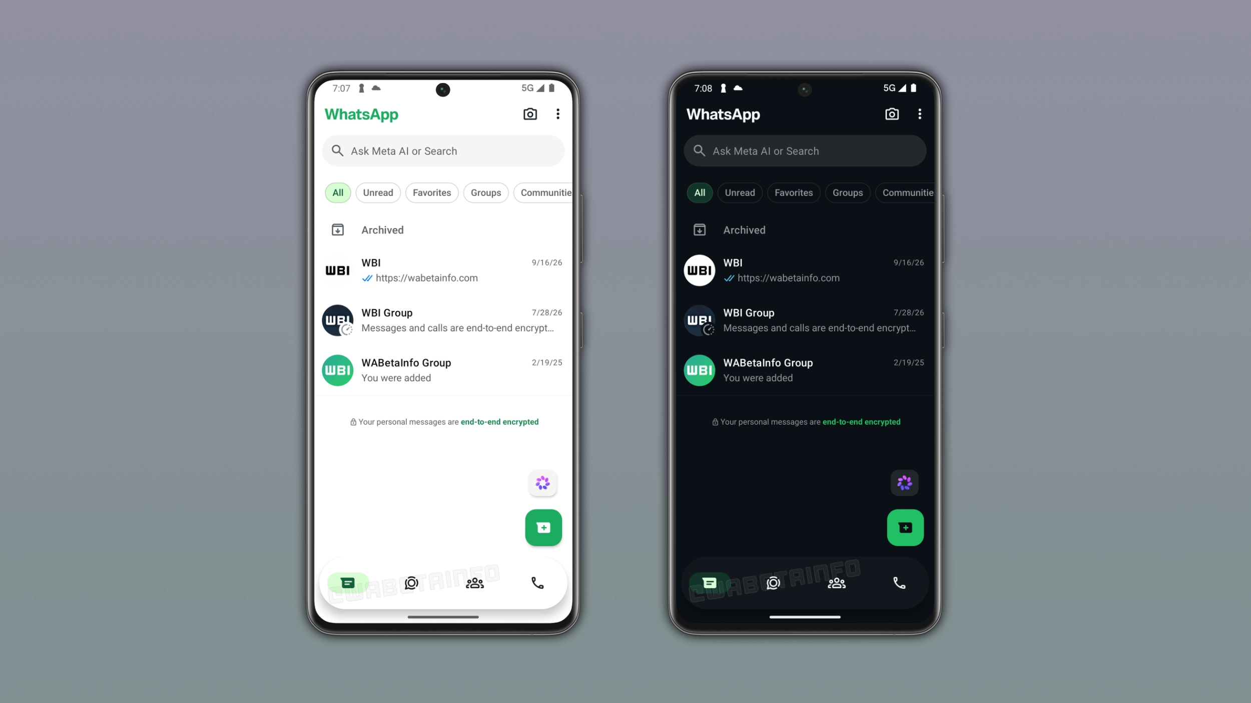
What the navigation bar looks like without labels
The attached image shows both the light and dark versions of the bar. WhatsApp represents the four tabs with icons only, with no text underneath. The floating shape and rounded corners from the previous design are still the same. The bar looks noticeably cleaner without the labels, making the design more minimal. The bar also looks wider in this version, as WhatsApp reduced the padding between the bar and the screen edges.
Why removing labels is a design choice worth considering
Labels make a navigation bar easier to understand for new users. However, most users already know what every icon represents. Without the labels, the bar feels lighter, more modern, and less cluttered. WhatsApp's icons are distinctive enough, and most users would recognize them without relying on the label.
The final design may still look different
Initially, we noted that the redesigned navigation bar was not complete In less than a week, WhatsApp is refining the bottom navigation bar further. WhatsApp is actively testing different configurations to understand what works best. However, users should not assume that this is the final design. WhatsApp may introduce further changes or include labels again ahead of the official release.
This is a development we are following together with our community
We are discovering the redesign for the bottom navigation bar step by step. We share what we discover as soon as we find it, and our readers are seeing the same evolution we are. Nobody knows yet what the final version will look like, since the redesign is still under development. We will continue to report any other change to the bar as WhatsApp keeps making decisions about the final design.
WhatsApp is still developing the bottom navigation bar for a future update
The redesigned bottom navigation bar is under development on Android. As a result, the bottom navigation bar is not available yet. WhatsApp will release it to users in a future update. At the moment, WhatsApp has not shared when the new navigation bar will become available to the public.
Connect with WABetaInfo
Follow WABetaInfo on X and visit our About page to learn more about what we do. We always appreciate your feedback on posts like this one.